colon-dash
Ian Mackay's scrapbook
Wednesday, 22 December 2010
Seasons greetings
I was in Trafalgar Square a few days ago - early evening and pouring with rain but the Christmas tree looked so good I had to take a snap. This is the best seasonal picture I have and thought it might bring a bit of Christmas cheer to this rather boring blog.
The view is from the steps of the National Gallery looking across Trafalgar Square down Whitehall towards the Houses of Parliament.
The Christmas tree is an annual gift from Norway and is decorated in Norwegian style with rows of lights running vertically.
My own Christmas plans have gone a little bit astray this year. Normally, Christmas day is like any other day in my house - dead miserable. However, this year I decided to make an effort and invited my daughter, her husband and all the grandchildren to lunch on Christmas day. I had this planned really well, I even ordered a large free-range turkey from a local farm shop well in advance, along with a very large ham.
Then the snow came. My daughter and her husband went on holiday to New York, they should have been back on Sunday (19th) but because the snow has closed Heathrow Airport they are still living it up in Manhattan.
The grandchildren came to stay with me along with their two pet rats. Unfortunately on the first day one of the rats died, which upset all the kids.
Now I'm waiting for a call from my daughter asking to be picked up from the airport as soon as she can arrange a flight home. This has put my well laid plans in jeopardy, as the day I had free to collect the turkey (24th) looks like it might be the day I have to rush to the Airport. In that case, no turkey as there is not enough time to make both trips, especially as the farm shop closes at noon.
So, it looks like the main course at this year's Christmas lunch will be the one remaining rat. Well, at least we'll get a leg each.
Update 24th December
It all turned out well in the end. My daughter landed back in the UK just after midnight on the 23rd. I collected her and her husband from the airport and took them to their house near Oxford. I was able to get the turkey on the 24th as planned - the rat was more than pleased I can tell you.
It looks like a Merry Christmas all round.
Thursday, 16 December 2010
Strange country ways
Before I moved to Berkshire I used to do a lot of walking in the countryside, mainly in the west country. Berkshire is covered in tarmac, so it's not safe to walk anywhere. About a year ago nostalgia got the better of me and I went on a short drive/walk/drive trip around interesting parts of Exmoor.
The English countryside is nothing like the twee world of Beatrix Potter or as portrayed by Evelyn Waugh's character William Boot in "Scoop". Boot wrote a newspaper column on country matters entitled "Lush Places" - "Feather-footed through the plashy fen passes the questing vole".
There are lush places to be found but beware, the countryside really is "red in tooth and claw" and if the wild animals don't get you, the misleading information on the signposts and the strange antics of other visitors certainly will.
Signposts in the country show "country miles" not normal miles. In my experience the numbers on the signposts do not specify distance but are actually a multiplier that indicates how much longer it takes you to walk a mile over the country terrain compared to one in town.
The great thing about walking in the country is that you can usually find a really nice pub where you can recover from the strain of trekking a country mile of two. A good country pub, such as the Exmoor Forest Inn at Simonsbath, caters for part-time country folk who wander off the paths and get covered in all sorts of muck.
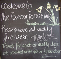 A warm welcome and excellent food usually awaits you provided you obey the rules and remove your muddy boots and give the dog a wipe over.
Having recovered, you head off for more country miles. However, beware of the animals. National Parks such as Exmoor are home to wild ponies and sheep, both of which kick, bite or butt and have been known to leave a lasting impression on walkers.
The great thing about wandering the countryside is that you can still find some delightful English rural architecture. This is the iconic packhorse bridge at Allerford in Porlock Vale. This is the real England that I love.
Tarr Steps is a medieval clapper bridge spanning the river Barle. Officially it's a Grade I listed building.
What is it about the English and rivers? Given the choice of a bridge or a ford, they always walk through the water not over it, even to the point of pushing the baby in a buggy - totally mad. Apart from the prospect of drowning, you could be run over by a 4x4.
It's a good idea to finish the day at a place where the countryside ends, then you know you can't go any further. I ended my trek at Blue Anchor on the Somerset Coast. Here the country miles dissolve into nautical ones, a much more precise measure of distance.
The English countryside is nothing like the twee world of Beatrix Potter or as portrayed by Evelyn Waugh's character William Boot in "Scoop". Boot wrote a newspaper column on country matters entitled "Lush Places" - "Feather-footed through the plashy fen passes the questing vole".
There are lush places to be found but beware, the countryside really is "red in tooth and claw" and if the wild animals don't get you, the misleading information on the signposts and the strange antics of other visitors certainly will.
Signposts in the country show "country miles" not normal miles. In my experience the numbers on the signposts do not specify distance but are actually a multiplier that indicates how much longer it takes you to walk a mile over the country terrain compared to one in town.
The great thing about walking in the country is that you can usually find a really nice pub where you can recover from the strain of trekking a country mile of two. A good country pub, such as the Exmoor Forest Inn at Simonsbath, caters for part-time country folk who wander off the paths and get covered in all sorts of muck.
 A warm welcome and excellent food usually awaits you provided you obey the rules and remove your muddy boots and give the dog a wipe over.
Having recovered, you head off for more country miles. However, beware of the animals. National Parks such as Exmoor are home to wild ponies and sheep, both of which kick, bite or butt and have been known to leave a lasting impression on walkers.
The great thing about wandering the countryside is that you can still find some delightful English rural architecture. This is the iconic packhorse bridge at Allerford in Porlock Vale. This is the real England that I love.
Tarr Steps is a medieval clapper bridge spanning the river Barle. Officially it's a Grade I listed building.
What is it about the English and rivers? Given the choice of a bridge or a ford, they always walk through the water not over it, even to the point of pushing the baby in a buggy - totally mad. Apart from the prospect of drowning, you could be run over by a 4x4.
It's a good idea to finish the day at a place where the countryside ends, then you know you can't go any further. I ended my trek at Blue Anchor on the Somerset Coast. Here the country miles dissolve into nautical ones, a much more precise measure of distance.
Saturday, 4 December 2010
Pachyderm parade
Winter has arrived early with a vengeance. Wild West Berkshire, normally sub-tropical until January, has been turned into a white featureless desert (turn the map over you fool). I decided that I needed cheering up and fired up iPhoto on my trusty MacBookPro to look at some warmer memories.
I've not had a break this year, so my selection of recent feel good photos was limited to the few that I took walking to work in the summer. I thought my pictures of the Elephant Parade in London, an event held in May/June this year, looked cheerful enough.
The purpose of the Elephant Parade was to raise money to improve the lot of real endangered elephants. The Parade comprised over 250 decorated elephants at various locations around London, mostly on the streets. After the public display the elephants were auctioned and over £4 million raised for elephant relief.
The decorative art work on the elephants varied from just a flat single colour to the most intricate and imaginative designs. The one below is my favourite with its really stunning opalescent finish.
I've not had a break this year, so my selection of recent feel good photos was limited to the few that I took walking to work in the summer. I thought my pictures of the Elephant Parade in London, an event held in May/June this year, looked cheerful enough.
The purpose of the Elephant Parade was to raise money to improve the lot of real endangered elephants. The Parade comprised over 250 decorated elephants at various locations around London, mostly on the streets. After the public display the elephants were auctioned and over £4 million raised for elephant relief.
Above: The group of elephants around City Hall on the South Bank of the Thames. This is very early in the morning with few people around and the sun low in the eastern sky.
Each elephant was decorated by a different artist and all of them were for sale.
The lone tourist, meticulously photographing and recording each elephant, asked me where we were. My childish sense of humour nearly got the better of me and I was very tempted to point out that the Tower of London was just across the river so this part of London was known as the Elephant and Castle.
However, I told the truth - Queens Walk in the Borough of Southwark. I probably didn't do him any favours, he will never be able to pronounce Southwark correctly and would have probably been much happier with Elephant and Castle.
The decorative art work on the elephants varied from just a flat single colour to the most intricate and imaginative designs. The one below is my favourite with its really stunning opalescent finish.
Thursday, 25 November 2010
The joy of six o'clock commuting
Today the Government announced an £8 billion investment in the railways to increase capacity. For us long-suffering commuters who spend hours standing on overcrowded trains it can't come soon enough. However, it's not just the trains that need improving, some of the infrastructure is in a pretty poor state and could do with a little TLC.
Commuting to London by train is not too hard if you live near a main station. Me, I live in the sticks and my local station, Thatcham, is a poor country cousin to the likes of Reading, Newbury or Oxford.
I have to be up at 4 am every day to get an early train to London and one Saturday last year I found myself the only punter for the 6 am train. Looking around the deserted station I was shocked by the state of the place.
The ticket office/waiting room was closed, the clock wasn't working, neither was the information screen and the ticket machine had been vandalised. To cap it all, being a Saturday, I couldn't even get a free Metro to read. What a depressing scene.
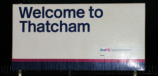 The only positive thing was a sign saying "Welcome to Thatcham". A little ironic when you consider the welcome that awaits any would be traveller arriving in a world without time and information and the prospect of a penalty fare if caught travelling without a ticket.
Since then, things have improved. The ticket machine has been repaired and the information system given a software upgrade and no longer slips into Jackson Pollock mode. The station has been repainted and a new Help Point console has been installed. Unfortunately, all the clocks have been removed but I suppose you can always use the Help Point to ask someone the time.
If this happens again I would like to complain to the Fat Controller about the poor facilities but as I'm half English, half Scottish, I have a slight dilemma on how best to approach the matter.
My English side says, phone the head office and politely explain that Thatcham Station has failed its usability acceptance test and wouldn't it be a good idea to spend some of the thousands I pay in fares each year on improving the place.
My inner Scot says climb to the top of the footbridge and shout abuse at the world - it's not my fault that my inner Scot is Rab C. Nesbitt.
Commuting to London by train is not too hard if you live near a main station. Me, I live in the sticks and my local station, Thatcham, is a poor country cousin to the likes of Reading, Newbury or Oxford.
I have to be up at 4 am every day to get an early train to London and one Saturday last year I found myself the only punter for the 6 am train. Looking around the deserted station I was shocked by the state of the place.
The ticket office/waiting room was closed, the clock wasn't working, neither was the information screen and the ticket machine had been vandalised. To cap it all, being a Saturday, I couldn't even get a free Metro to read. What a depressing scene.
 The only positive thing was a sign saying "Welcome to Thatcham". A little ironic when you consider the welcome that awaits any would be traveller arriving in a world without time and information and the prospect of a penalty fare if caught travelling without a ticket.
 Since then, things have improved. The ticket machine has been repaired and the information system given a software upgrade and no longer slips into Jackson Pollock mode. The station has been repainted and a new Help Point console has been installed. Unfortunately, all the clocks have been removed but I suppose you can always use the Help Point to ask someone the time.
If this happens again I would like to complain to the Fat Controller about the poor facilities but as I'm half English, half Scottish, I have a slight dilemma on how best to approach the matter.
My English side says, phone the head office and politely explain that Thatcham Station has failed its usability acceptance test and wouldn't it be a good idea to spend some of the thousands I pay in fares each year on improving the place.
My inner Scot says climb to the top of the footbridge and shout abuse at the world - it's not my fault that my inner Scot is Rab C. Nesbitt.
Sunday, 21 November 2010
Up the Gherkin
In 2008 I found myself working for an Insurance Broker in the City. Their office is in Mitre Street, in the shadow of the tower that everyone calls the "Gherkin". Officially, it's 30 St Mary Axe.
I used to spend my lunch hours in the Gherkin plaza just taking in the symmetry of the excellent design and construction that makes this building one of the best in Europe.
I always wanted to go inside and one day a colleague, who knew someone who worked there, managed to get me into the restaurant on the top floor (floor 39). The food wasn't very spectacular, but the view certainly was.
Bearing in mind that you have to photograph everything through curved glass (lots of reflections and flare) and it was a very dull day, I was quite amazed at some of the pictures I took.
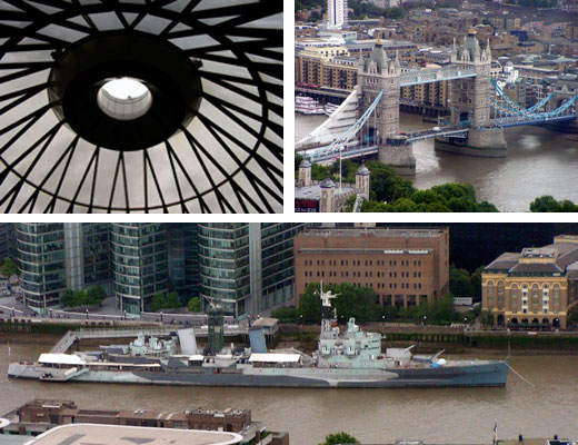
The ceiling of the 39th floor, Tower Bridge and HMS Belfast.
Canary Wharf, the London Eye and the 2012 Olympic Stadium.
Top: Tower of London. Bottom: Looking west down the Thames - Waterloo Bridge, Hungerford Bridge and Cleopatra's Needle.
Below: Lunchtime at the plaza on a typical summer's day. Seasonal refreshment from the Sterling, a pub on the ground floor of the Gherkin.
Sunday, 14 November 2010
What type are you?
I have just finished reading a lovely little book about type design and typography - boring? Definitely not.
Typefaces are a major part of our visual experience and anyone with a computer probably has access to dozens of fonts. We all like to use them to express ourselves in email, letters or, if you're like me, creating that special menu or party invitation using Photoshop.
So whether you find it interesting or not, type is everywhere and has a strong emotional effect on how we perceive and react to so many forms of visual communication.
The author of Just My Type, Simon Garfield, has produced a really interesting account of the history and development of type. Simon's excellent knowledge of the subject and entertaining and witty style make this a really good read.
This book explains how fonts have become such a big part of our lives and also offers some advice on how and when to use them. The book itself uses over a 100 fonts with chapters describing a particular font and its designer. (It's worth reading for the chapter on Comic Sans alone.)
The story is right up-to-date and includes the fonts you see on your mobile phone but starts with the earliest type designs produced in the 1440s. The book is also a potted history of printing technology and on a personal note it covers my career in printing exactly.
When I started in print in 1962, everything was hot metal and letterpress - William Caxton could have walked into any 1960s printing house and started setting type. By the time the Beatles disbanded in 1970 everything had changed. Offset Litho was king and hot metal had given way to computer-set type on film. ( or "cold type" as we called it in those days).
This book covers nearly all the typesetting technology I worked with, hot metal (Monotype and Linotype), the Lumitype film setter, the IBM Selectric Typewriter with the interchangeable type sphere ("golf ball"), which could be used to produce camera-ready copy to make a printing plate. I used a Selectric a lot in the early days of computer typesetting, then we called them "idiot boards" as you didn't have to make any decisions about word breaks, just type in the text.
The Selectric typewriter was connected to a punch producing paper tape which was fed into a computer. The computer converted the octal encoded punched tape into punched tape that could be read by the control unit of the Lumitype film setter. All the printing technology was in the computer and one of the first jobs I did when I started using computers was to type in a hyphenation dictionary.
There is even a chapter on Letraset, the rub down lettering that made everyone a typographer - I still have a stack of this stuff in the attic. The description of how Letraset was made is really interesting. The process took a long time to create a complete font as every character was cut by hand before photographing and the type cutters worked in a windowless factory to avoid dust.
All major type designers are mentioned in the book, Eric Gill and Edward Johnston (who created the font for the London Underground) are two of my particular favourites. Although Gill would probably be on the sex offenders register if he were still alive.
There are some interesting asides, such as the designer who writes a blog about inappropriate typefaces used in films. This is just too pedantic, please get a life. Then there was the outrage when IKEA changed its font from Futura to Verdana, apparently the O in Futura reminded everyone of the classic Swedish meatball. The New York Times commented that this was probably the biggest controversy ever to come out of Sweden. You can't mess with IKEA - they're part of the furniture.
There is also a section about an online questionnaire that you can use to find out "What type are you?". I like to think that I'm Bodoni, slim, elegant, upright and oozing class, although others see me more as Expanded Antique, which to my eyes is Bodoni that has aged, suffers from rheumatism and doesn't do very much exercise.
The book also tries to define the world's worst typeface, and guess which one it is - 2012 Headline, the font chosen for the 2012 Olympics. It's nice to know that Team GB have already won an Olympic medal, coming first in the crap typeface competition.
Just My Type by Simon Garfield, published by Profile Books, 2010.
Colon-Dash rating: :-) :-) :-) :-) :-)
Typefaces are a major part of our visual experience and anyone with a computer probably has access to dozens of fonts. We all like to use them to express ourselves in email, letters or, if you're like me, creating that special menu or party invitation using Photoshop.
So whether you find it interesting or not, type is everywhere and has a strong emotional effect on how we perceive and react to so many forms of visual communication.
The author of Just My Type, Simon Garfield, has produced a really interesting account of the history and development of type. Simon's excellent knowledge of the subject and entertaining and witty style make this a really good read.
This book explains how fonts have become such a big part of our lives and also offers some advice on how and when to use them. The book itself uses over a 100 fonts with chapters describing a particular font and its designer. (It's worth reading for the chapter on Comic Sans alone.)
The story is right up-to-date and includes the fonts you see on your mobile phone but starts with the earliest type designs produced in the 1440s. The book is also a potted history of printing technology and on a personal note it covers my career in printing exactly.
When I started in print in 1962, everything was hot metal and letterpress - William Caxton could have walked into any 1960s printing house and started setting type. By the time the Beatles disbanded in 1970 everything had changed. Offset Litho was king and hot metal had given way to computer-set type on film. ( or "cold type" as we called it in those days).
This book covers nearly all the typesetting technology I worked with, hot metal (Monotype and Linotype), the Lumitype film setter, the IBM Selectric Typewriter with the interchangeable type sphere ("golf ball"), which could be used to produce camera-ready copy to make a printing plate. I used a Selectric a lot in the early days of computer typesetting, then we called them "idiot boards" as you didn't have to make any decisions about word breaks, just type in the text.
The Selectric typewriter was connected to a punch producing paper tape which was fed into a computer. The computer converted the octal encoded punched tape into punched tape that could be read by the control unit of the Lumitype film setter. All the printing technology was in the computer and one of the first jobs I did when I started using computers was to type in a hyphenation dictionary.
There is even a chapter on Letraset, the rub down lettering that made everyone a typographer - I still have a stack of this stuff in the attic. The description of how Letraset was made is really interesting. The process took a long time to create a complete font as every character was cut by hand before photographing and the type cutters worked in a windowless factory to avoid dust.
All major type designers are mentioned in the book, Eric Gill and Edward Johnston (who created the font for the London Underground) are two of my particular favourites. Although Gill would probably be on the sex offenders register if he were still alive.
There are some interesting asides, such as the designer who writes a blog about inappropriate typefaces used in films. This is just too pedantic, please get a life. Then there was the outrage when IKEA changed its font from Futura to Verdana, apparently the O in Futura reminded everyone of the classic Swedish meatball. The New York Times commented that this was probably the biggest controversy ever to come out of Sweden. You can't mess with IKEA - they're part of the furniture.
 |
| 2012 Headline, about to take over the world. Seen here on the London Underground. |
The book also tries to define the world's worst typeface, and guess which one it is - 2012 Headline, the font chosen for the 2012 Olympics. It's nice to know that Team GB have already won an Olympic medal, coming first in the crap typeface competition.
Just My Type by Simon Garfield, published by Profile Books, 2010.
Colon-Dash rating: :-) :-) :-) :-) :-)
Spot the difference
 |
| Berkshire Life Private Eye |
On looking up from the bread, the latest edition of Berkshire Life caught my eye and I just had to buy a copy and put the two covers together.
Both magazines are trying to exploit the success of "Downton Abbey" a TV drama series that was recently shown on ITV in the UK. As I detest period drama, I didn't actually watch "Downton Abbey" but millions of people did.
"Downton Abbey" is set in the Edwardian era. It was written by Julian Fellowes, who won an Oscar for his Gosford Park screenplay.
Highclere Castle, the home of Lord Carnarvon, was used as the fictional "Downton Abbey". Highclere Castle is just down the road from where I live in West Berkshire but it's in Hampshire, so what it's doing on the cover of Berkshire Life I don't really know.
The Berkshire Life cover is a publicity shot from the TV production company and shows the actual cast. Private Eye's Photoshop pastiche has members of the Coalition Government plus a former Prime Minister - they actually look more Edwardian than the actors (if you're going to set the country back 100 years you might as well look the part I suppose).
My picture below shows what a depopulated Highclere Castle looks like.
Spot the difference answers: The leading lady in the TV drama was played by Dame Maggie, in the Private Eye version she is played by Baroness Maggie. Dame Maggie is a talented actress and national treasure and Baroness Maggie isn't.
Subscribe to:
Comments (Atom)


